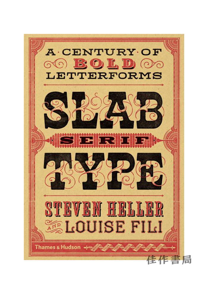
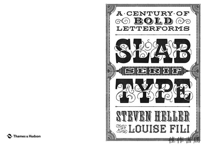
Slab Serif Type: A Century of Bold Letterforms/平板衬线字体:一个世纪的粗体字
| 运费: | ¥ 9.00-46.00 |
商品详情
定价:248.0
ISBN:9780500518496
作者:Steven Heller
版次:1
出版时间:2016-08
内容提要:
书名: Slab Serif Type: A Century of Bold Letterforms/平板衬线字体:一个世纪的粗体字
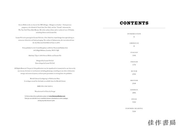
作者:Steven Heller
出版:Thames & Hudson,2016
语种:英语
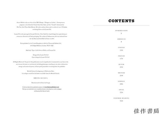
装帧:精装,352页
尺寸:17.5*24.8 cm
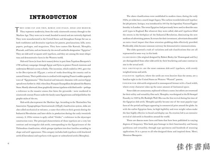
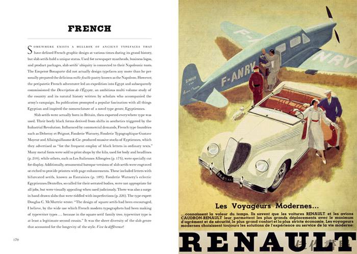
A compact, yet comprehensive design resource, expertly selected by graphic design’s leading historians
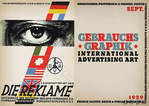
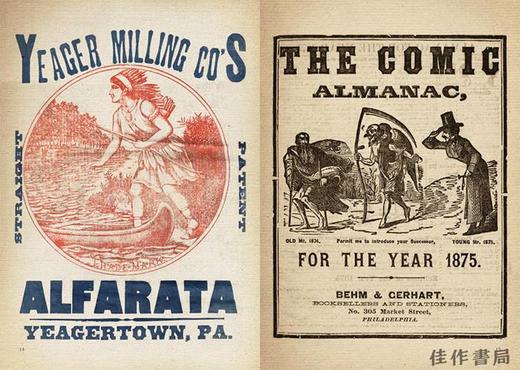
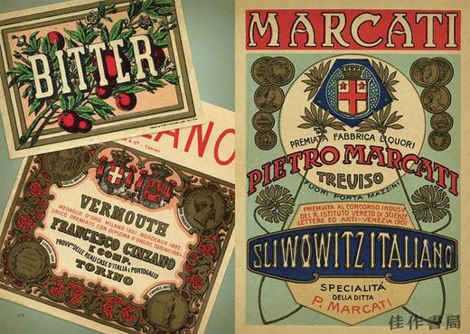
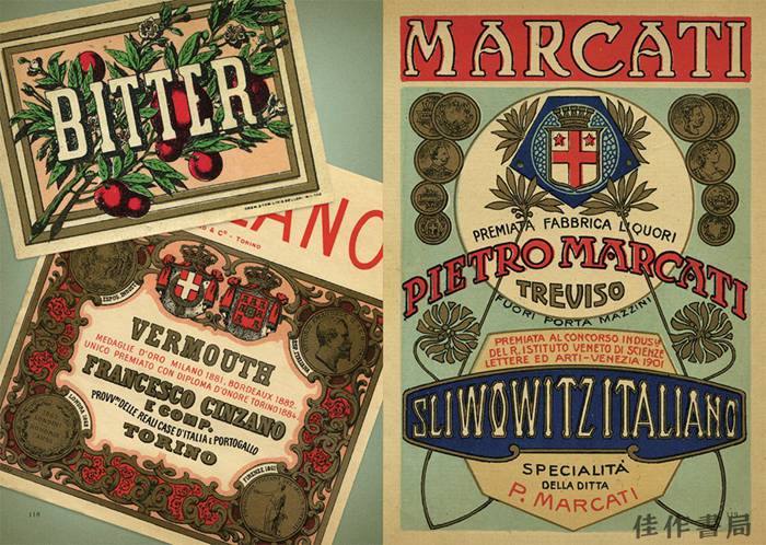
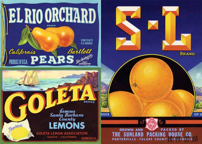
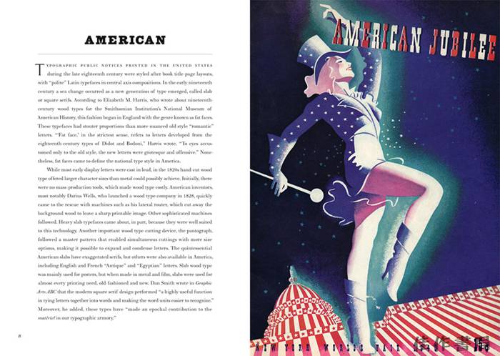
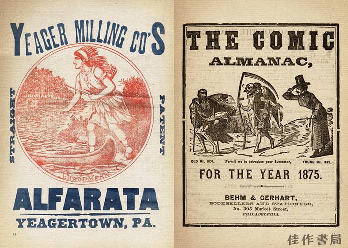
The slab serif typeface―in their classic form, wood types made for large-scale posters, ads, and newspapers―may not be as all-purpose as the gothic or sans serif, but it is equal, if not more powerful, in graphic appeal. Since being introduced in the nineteenth century, slabs have become ubiquitous and are today as popular as ever.
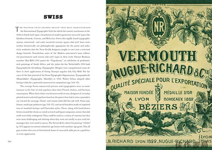
Slabs come from a genre of Egyptian typefaces (some of the leading slabs are called Cairo and Sphinx) brought back to France by Napoleon and marketed in specimen sheets and books as representing a glorious heritage brought to the present. In 1931, Morris Fuller Benton created the Stymie typeface, a reworking of a slab serif type popular in Europe at that time: Memphis. The IBM logo is one of the most famous slab serif marks. The serifs were often exaggerated so they would not result in simply beautiful letterforms but would be functionally superior to other faces. Slabs, therefore, came in many iterations and were eventually recognized as a face with many characters―and nationalities.
Following the cult typography volumes Scripts, Shadow Type, and Stencil Type, this new volume comprises an artfully curated selection of hundreds of international and classic examples to inspire fresh and unexpected typographic ideas.


- 佳作书局 (微信公众号认证)
- 佳作书局(PARAGON BOOK GALLERY)自1942年创办以来专注于中外艺术书籍的引介和出版。
- 扫描二维码,访问我们的微信店铺
- 随时随地的购物、客服咨询、查询订单和物流...

