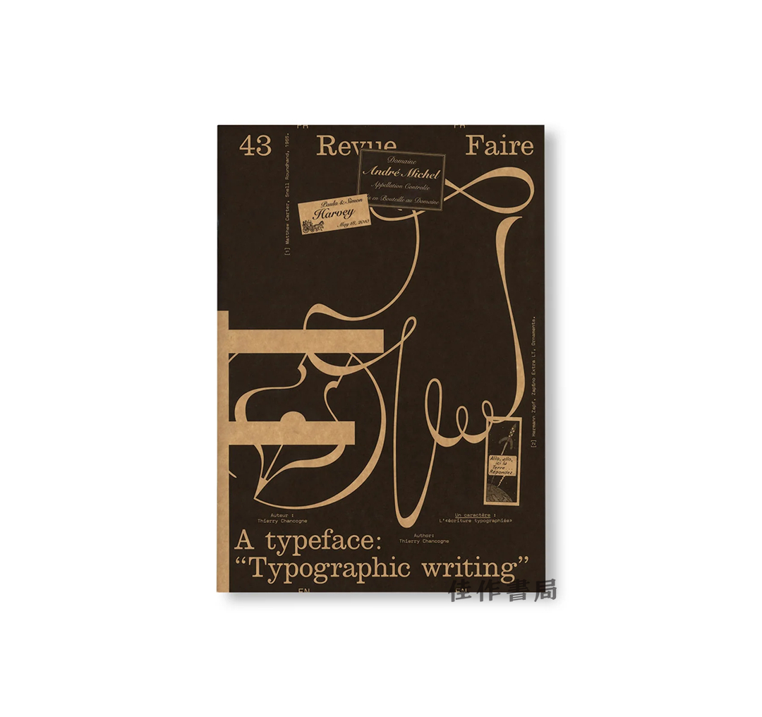
Revue Faire 43 - A typeface: "Typographic writing" / Revue Faire 第43期:一种字体:"印刷体书写"
| 运费: | ¥ 8.00-30.00 |


商品详情
定价:78.0
ISBN:9791095991571
作者:Thierry Chancogne
版次:1
出版时间:2025-09
内容提要:
书名:Revue Faire 43 - A typeface: "Typographic writing" / Revue Faire 第43期:一种字体:"印刷体书写"
作者:Thierry Chancogne
出版:Editions Empire,2025年
装帧:平装,36页
语种:法文, 英文
尺寸:21*30*0.2 cm
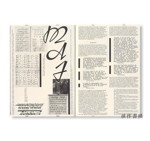
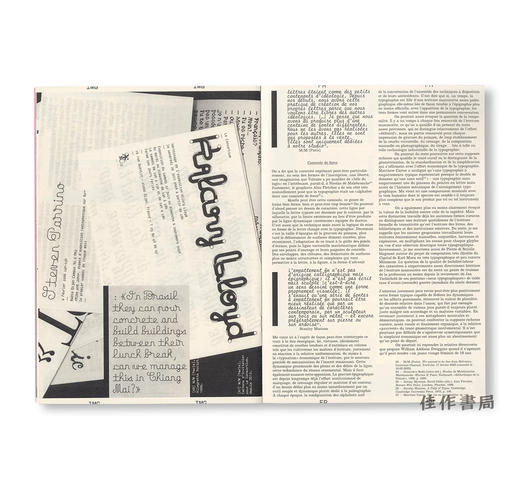
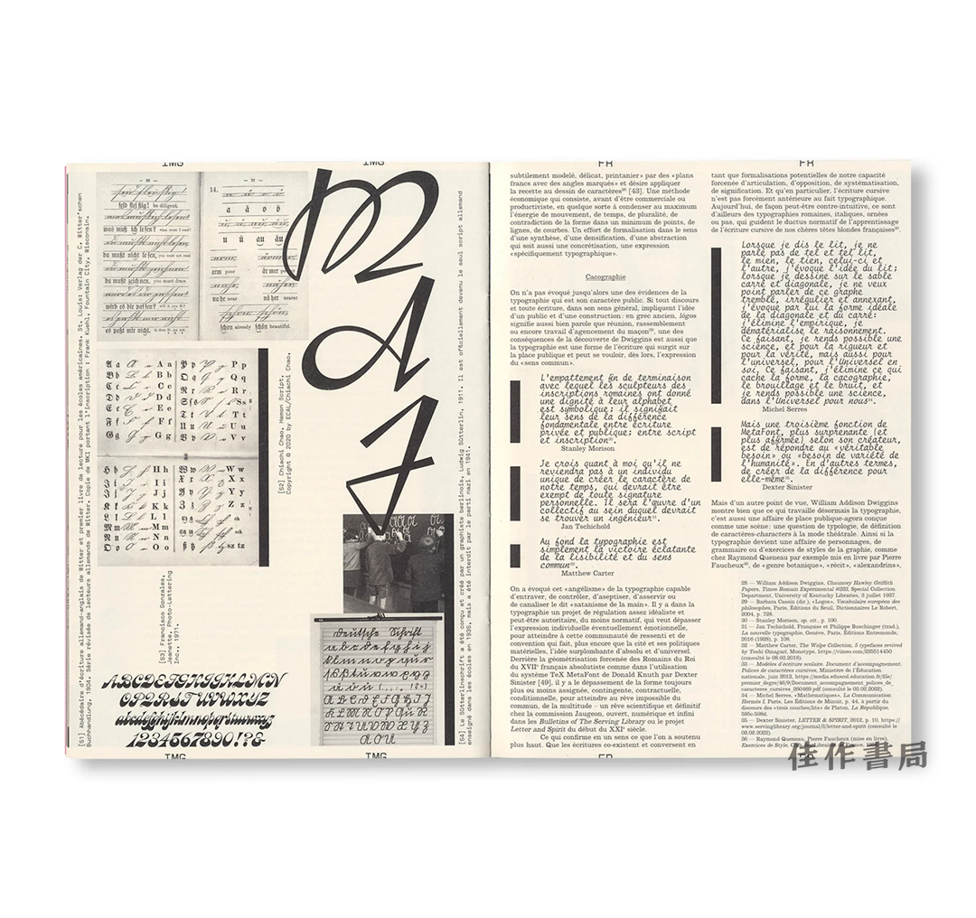
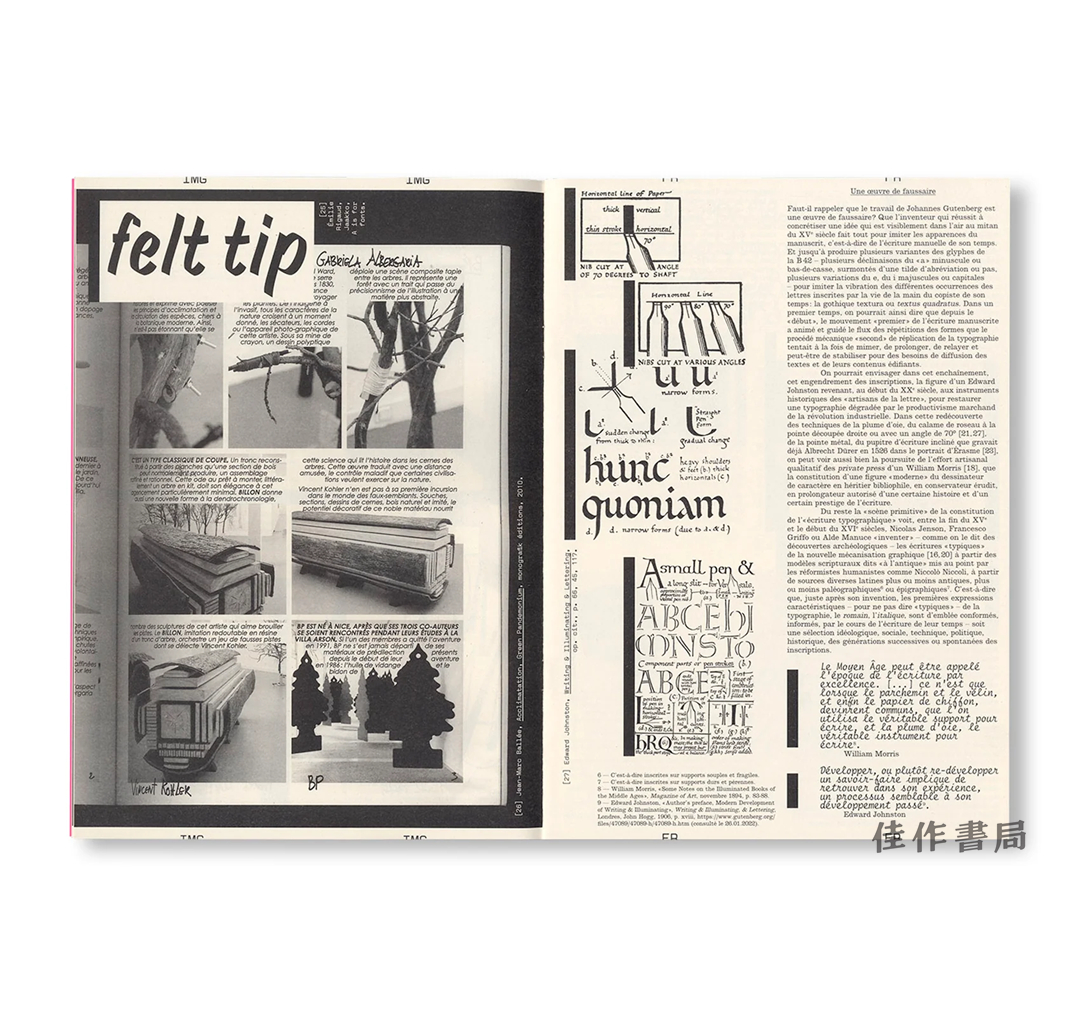
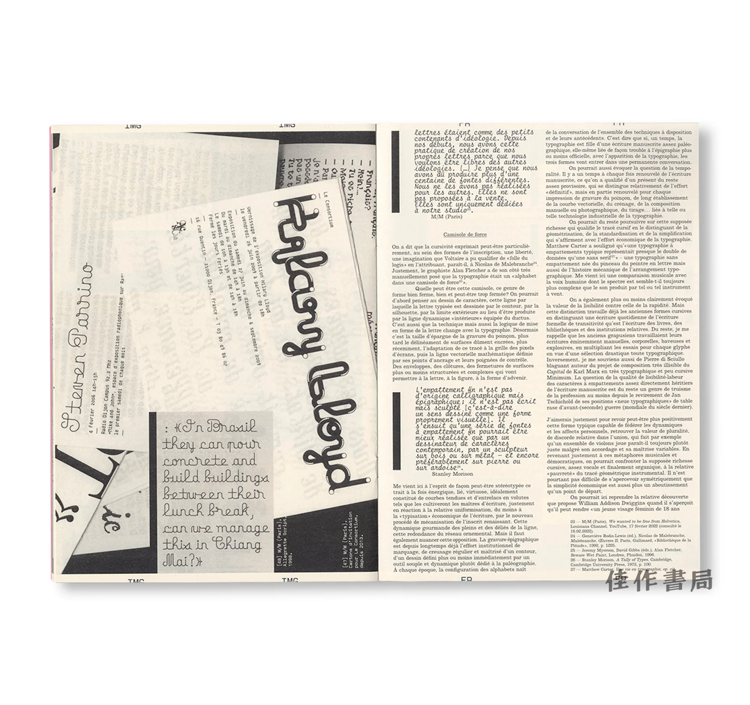
这份再版的第43期批判性平面设计期刊,对书写与字体排印之间的互动关系进行了反思。在1920年出版的《印刷字体》一书中,弗朗西斯·蒂博多将其现代字体排印手册题献给乔治·奥里奥尔,并称其为“字体排印书写的革新者”。书中展示了多款奥里奥尔独具特色的字体——包括Auriol-champlevé、Auriol labeur、Fran?aise Légère以及Robur Noir。其中,Auriol labeur尤为突出:它是一款镂版字体,将书写中富有表现力的手绘鲜活感与工业生产的机械精确性融为一体——蒂博多用“字体排印书写”这一看似矛盾的表述捕捉了这种结合。本期期刊重新审视了那些长久以来的问题:书写中的个人化笔触如何与字体排印的标准化逻辑共存?字体——这些抽象、可复现的形式——能否承载手写体与历史中的鲜活能量?
The reissue of issue 43 of the critical graphic design journal offers a reflection on the dynamics between writing and typography. In La Lettre d’imprimerie (1920), Francis Thibaudeau dedicated his manual of modern typography to Georges Auriol, whom he called “the innovator of typographic writing.” The book showcases several of Auriol’s distinctive typefaces - including Auriol-champlevé, Auriol labeur, Fran?aise Légère, and Robur Noir. Among these, Auriol labeur stands out: a stencil typeface that merges the expressive, hand-brushed vitality of writing with the mechanical precision of industrial production - an oxymoron Thibaudeau captured in the phrase “typographic writing.” This issue revisits enduring questions: How does the personal gesture of writing coexist with the standardized logic of typography? Can typefaces - these abstract, repeatable forms - carry the living energy of handwriting and history?
- 佳作书局 (微信公众号认证)
- 佳作书局(PARAGON BOOK GALLERY)自1942年创办以来专注于中外艺术书籍的引介和出版。
- 扫描二维码,访问我们的微信店铺
- 随时随地的购物、客服咨询、查询订单和物流...